Speedo
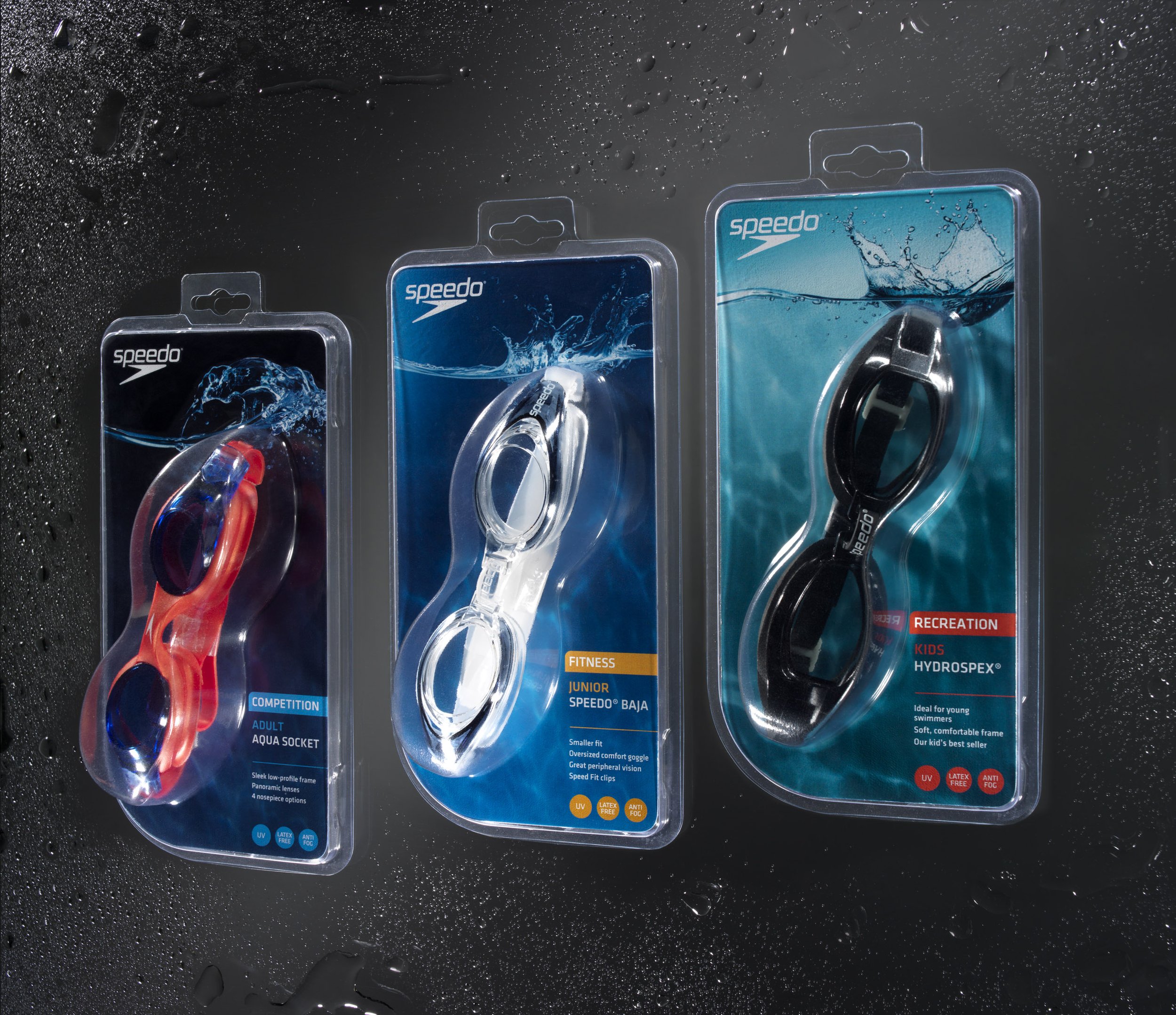
We were tasked with reimagining and bringing clarity and consistency to the Speedo product packaging line. As part of this initiative, we identified and categorized three distinct levels of swimmer enthusiasts: recreational, fitness, and competitive.
To visually represent these levels, we introduced a concept called “water plates”, using varying water depths as a metaphor. The packaging features a gradient of water tones to signify each category:
Recreational swimmers are represented by the shallow, aqua-green hues of a calm pool.
Fitness swimmers are denoted with mid-depth, medium-toned blues.
Competitive swimmers are marked by the deep, dark blues of open water, evoking intensity and performance.
This color-coded system brings intuitive navigation, visual harmony, and a clear hierarchy across the Speedo packaging range.

